A user interface redesign that gifts Duolingo users with more versatility and choice in their lesson topics, while maintaining a clean and effective lesson flow.
1. project overview.
Not created in association with Duolingo. This case study was prepared after the 2023 DUOCON presentation. I was motivated by a search-through of user reviews and feedback I found online to contribute new designs and ideas to Duolingo.
Duration: December 27, 2023 - January 5, 2024.
Role: Visual Designer, UI Designer, UX Designer, Researcher.
Tools: Figma, Fig Jam, Balsamiq, Adobe Photoshop, Adobe Illustrator.
Client: Duolingo (Unofficial)
2. duolingo, what is it?
Duolingo is a rapidly growing learning platform, mobile app, and website. Previously competing only in the language development sector, Duolingo has now recently expanded into the music and math fields, with future plans to grow and encompass all fields in learning.
Mission to develop the best education in the world and make it universally available.
3. personal experience.
With a longtime streak of over 400 days in both French and Italian classes, I am a self-admitted Duolingo fan. So, as a longtime user of both Duolingo's mobile and desktop versions, I have been able to emphasize with many user pain points and frustrations. As a result, I wanted to create a project that could address these issues.
4. research, user quotes, and pain points.
In order to ensure that I was getting a breadth of data outside of personal experience, I conducted research through qualitative and quantitative research on Duolingo users. I limited my research to Duolingo's language features as those are the ones with the most users, current relevant data, and the one I have the most experience with.
Sources used:
60%
of users complete only 1 Duolingo lesson per day.
83.3%
of users prefer the freedom to choose their own lesson paths.
50%
of users did not like or were unsure if they liked story lessons.
"I have gotten used to the new UI, but the old one gave me more freedom to hop around and explore what phrases/situations I was more interested in in any given day".
- Anonymous User
"Before, if I got frustrated with my performance in a unit, I could move to another one for a few lessons and then return to the one I was having trouble with, with a better disposition".
- Anonymous user
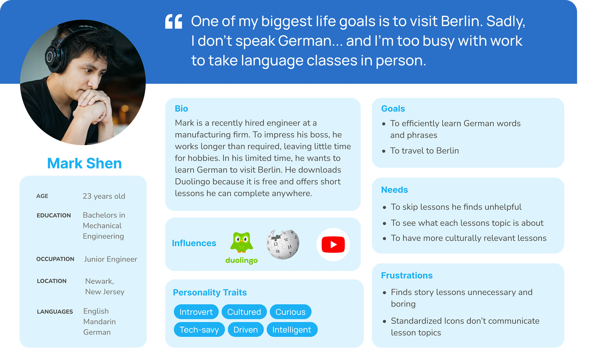
5. user persona.
Using the research I gathered, a user persona was created to help me better empathize with users, as well as narrow the focus on the main pain-points I should address.
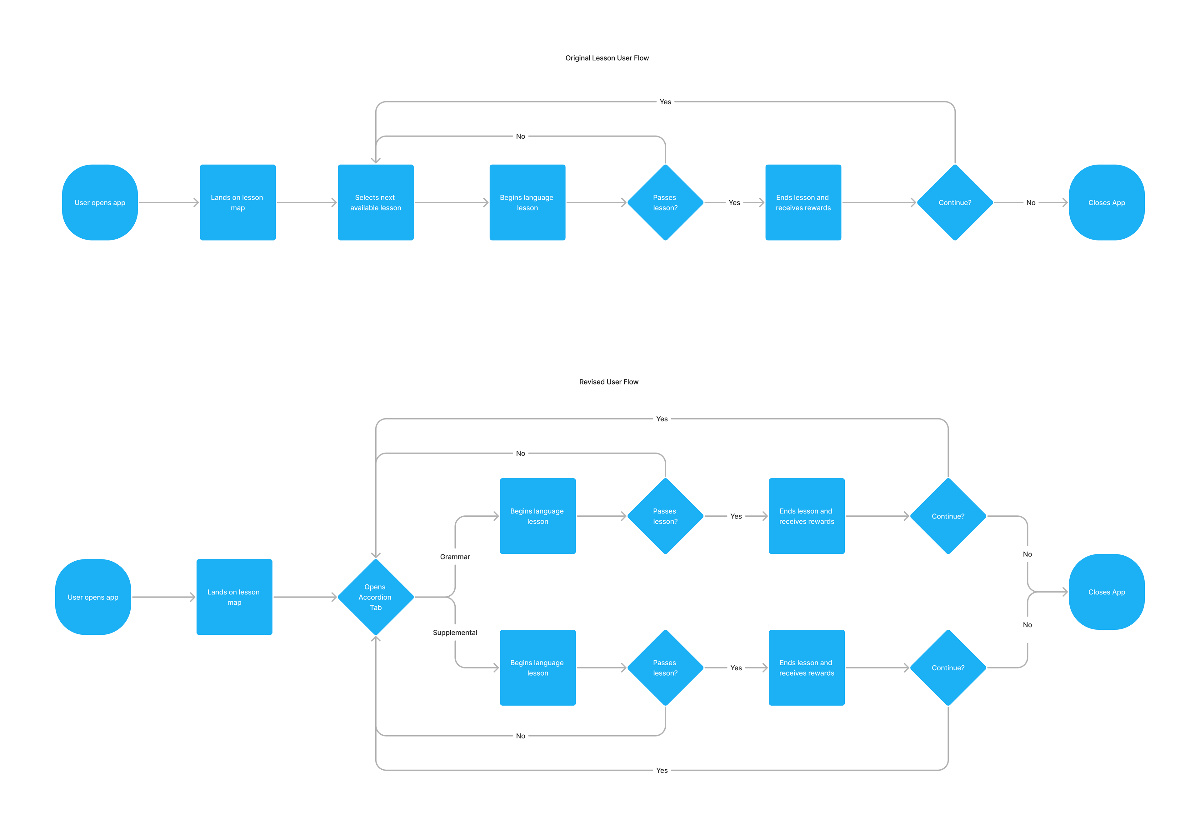
6. user flow.
Prior to the early wireframing, a user flow was made to help plan out potential screens and layouts. The focus of the user flow is emphasizing the increase in choice that the redesign will provide users.
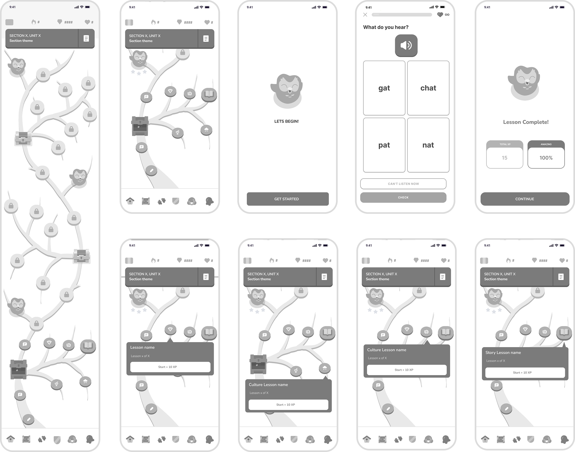
7. early prototype exploration.
Initial exploration of a new learning "tree". Feedback found this early design to be visually overwhelming and hard to follow. However, the idea of an opening path was still seen as interesting, and with a more streamlined design, this concept could be a strong concept to develop the project from.
8. low fidelity prototype.
Revised lo-fi design that emphasizes visually legibility as much as possible. An expanding accordion button was added that would contain 3 lessons, only one of which needs to be successfully completed for a user to advance in the learning tree. This will give users choice in which of the subjects they prefer, while still keeping the learning tree simple with all the essential lessons in the path. Users found this design easy to understand and use.
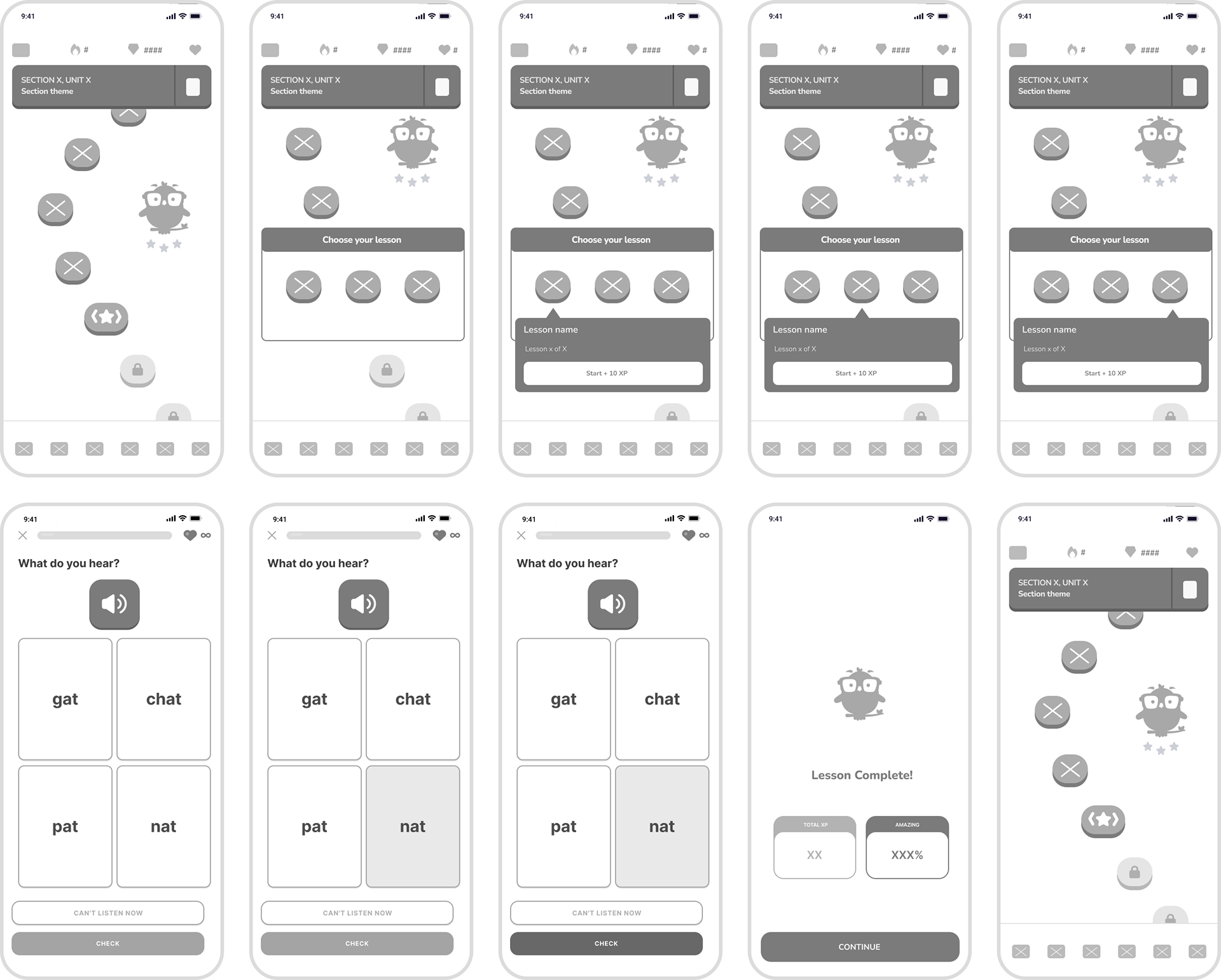
9. accordion button concepts.
Exploring accordion button designs and receiving feedback to determine which most stands out and communicate. The middle-left design was found to be the easiest to read and most recognizable based on user feedback, as it utilized Duolingo's established star motif but it's larger horizontal size and 2 arrows pointing outwards communicated to users that it was.
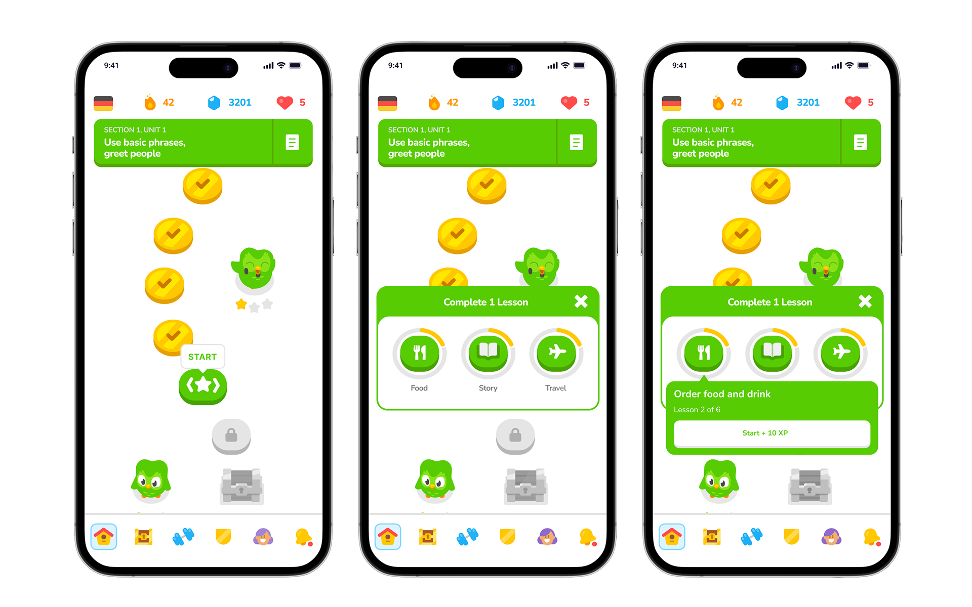
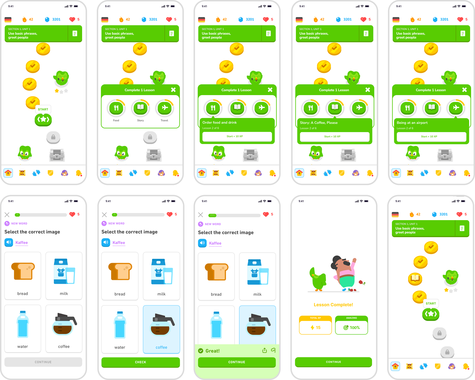
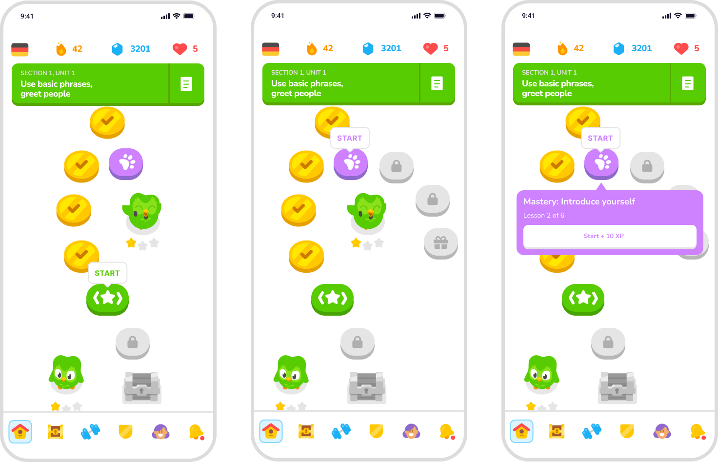
10. high fidelity prototype.
Following feedback from the low fidelity prototype, I opted to remove story lessons from the learning path and instead put them into the accordion. This would allow users who do not wish to do stories to have the option to skip them. The accordion's header now changes the text to "Complete 1 lesson" to indicate to the user that only one of the lessons needs to be finished. An "X" was also added to the pop-up accordion, even if simply tapping out would close the window. This "X" button would reinforce that the window can always be closed.
11. FIGMA Prototype.
Below is the high fidelity Figma prototype I created for the project. Click on the expand icon on the top right of the window for the best viewing experience.
12. additional ideas.
An additional idea was suggested to me that I wanted to develop. This idea would be a completely optional extending branch path. that would allow users to fully master and further reinforce their existing knowledge with slightly more difficult lessons.
13. credits.
I'd like to thank Paulina Sanchez, Carlos Romero, Lyndon Nadel, Paul Barbato, Alex Priestley, and Loz Atkinson for taking the time to give very thorough feedback, critiques, and make amazing suggestions throughout my project. I'd also like to thank all the people who participated in my research interviews, polls, and prototype tests. Finally, I would like to give a thank you to everyone who created any data I used for research throughout the project.